Building Two Different Types of Progress Bars

The other day when browsing Dribble, I stumbled over some awesome-looking progress bars made by Pierluigi Giglio.

When building SaaS products, you will end up having to add a progress bar sooner or later. I think it would be a great exercise to implement a couple of them in React.
Let's get started by adding Styled Components for our CSS. It will be great for dynamically changing CSS values.
yarn add styled-components
yarn add -D @types/styled-components
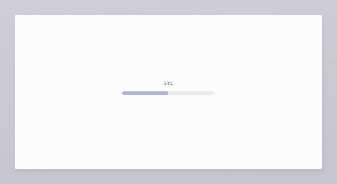
We'll start with progress bar number three in the picture above. It's a pretty standard one that we can use in many places.
Let's create a small component that takes the current progress as property and displays the number.
export function ProgressBar({ progress, width = 300 }: ProgressBarProps): ReactElement {
  return (
    <Container width={ width }>
      <Text>
        { progress }%
      </Text>
    </Container>
  );
}

const Container = styled.div<{ width: number }>`
  width: ${ props => props.width }px;
`;

const Text = styled.div`
  color: hsla(225, 23%, 62%, 1);
  font-weight: bold;
  letter-spacing: 0.025em;
  margin-bottom: 1rem;
  text-align: center;
  width: 100%;
`;
One feature of Styled Components that we will rely on is variable interpolation. As the styled helper is a Template literal, we can use string interpolation to pass values from our JSX directly to our CSS.
const Container = styled.div<{ width: number }>`
  width: ${ props => props.width }px;
`;
For the bar itself, we'll use two elements stacked on top of each other. The bottom one will have the "unfilled" color and take up the whole width. The top one will have the "filled" color and its width will depend on our progress.
const Bar = styled.div`
  background: hsla(225, 20%, 92%, 0.9);
  border-radius: 0.5rem;
  height: 0.75rem;
  width: 100%;
`;
Another cool thing about Styled Components is that you can extend one of your Styled Components and add or override attributes.
const FilledBar = styled(Bar)<{ width: number }>`
  background: hsla(225, 23%, 72%, 0.9);
  transition: width 0.5s ease-out;
  width: ${ props => props.width }%;
`;
We'll use string interpolation again to determine how wide the filled bar should be.
<Bar>
  <FilledBar width={ progress } />
</Bar>
If we add some buttons to change the progress, we can see our new progress bar in action! 🍾
export function App(): ReactElement {
  const [ progress, setProgress ] = useState(50);

  const updateProgress = (delta: number): void => {
    const newProgress = Math.max(0, Math.min(100, progress + delta));

    setProgress(newProgress);
  };

  return (
    <Container>

      <Row>
        <ProgressBar progress={ progress } />
      </Row>

      <Row>
        <Button onClick={ () => updateProgress(-10) }>
          Decrease
        </Button>
        <Button onClick={ () => updateProgress(+10) }>
          Increase
        </Button>
      </Row>
    </Container>
  );
}
The updateProgress function uses what's called a Clamp function. It makes sure that value is kept between a lower and upper bound, in this case, 0 and 100%.
If you play around with it for a little bit you'll quickly notice how staggering it feels. Not smooth at all. Instead of jumping directly to the new value, we can animate the bar so it moves there over time instead.
const FilledBar = styled(Bar)<{ width: number }>`
  ...
  transition: width 0.5s ease-out;
  ...
`;
The transition property is an easy way to animate or tween values in CSS. It will automatically apply when changing the specified property. The first parameter is the property we are interested in, the width. The second one is the duration of the animation. You can play around with it to find a fitting duration.
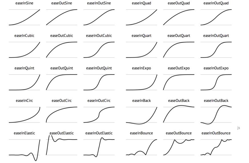
The third parameter is what's called an easing function. It's a curve that describes how fast or slow the animation will play during different parts of the duration. A linear curve will have a consistent speed throughout the animation. ease-in will start slow but speed up towards the end and ease-out will do the reverse.
The idea behind using easing function or animation curves is to smooth out the animation and make it feel more realistic as real motion seldom happens at a constant speed. There is a ton of curves you can try but the ones mentioned are the most popular.
Our progress bar is starting to take form but there's another improvement we can do. Adding Aria roles to our markup will make it easier for assistant devices such as screen readers to make sense of our application.
    <Container
      aria-label={ label }
      aria-valuemax={ 100 }
      aria-valuemin={ 0 }
      aria-valuenow={ progress }
      role="progressbar"
      width={ width }
    >
Now we have a fully-fledged progress bar! Here it is in its entirety:
import React, { ReactElement } from 'react';
import styled from 'styled-components';

interface ProgressBarProps {
  progress: number;

  label?: string;
  width?: number;
};

export function ProgressBar({
  progress,
  label = 'Progress Bar',
  width = 300
}: ProgressBarProps): ReactElement {
  return (
    <Container
      aria-label={ label }
      aria-valuemax={ 100 }
      aria-valuemin={ 0 }
      aria-valuenow={ progress }
      role="progressbar"
      width={ width }
    >
      <Text data-testid="progress-bar-text">
        { progress }%
      </Text>

      <Bar>
        <FilledBar
          data-testid="progress-bar-bar"
          width={ progress }
        />
      </Bar>
    </Container>
  );
}

const Bar = styled.div`
  background: hsla(225, 20%, 92%, 0.9);
  border-radius: 0.5rem;
  height: 0.75rem;
  width: 100%;
`;

const FilledBar = styled(Bar)<{ width: number }>`
  background: hsla(225, 23%, 72%, 0.9);
  transition: width 0.5s ease-out;
  width: ${ props => props.width }%;
`;

const Container = styled.div<{ width: number }>`
  width: ${ props => props.width }px;
`;

const Text = styled.div`
  color: hsla(225, 23%, 62%, 1);
  font-weight: bold;
  letter-spacing: 0.025em;
  margin-bottom: 1rem;
  text-align: center;
  width: 100%;
`;
Before we ship it, let's add a test to make sure it works, now and in the future. 🚢
  it('has a label with the current progress.', () => {

    render(<ProgressBar progress={ 45 } />);

    const label = screen.getByTestId('progress-bar-text');

    expect(label).toHaveTextContent('45%');
  });
Using Testing Library we'll render the component, filled by 45%.
render(<ProgressBar progress={ 45 } />);
We'll grab the text element using the Screen utility and the getByTestId function. I like test ids for testing. Adding an extra property like data-test-id="progress-bar" and querying by that instead of something like a CSS selector makes your tests more resistant. You only want your tests to fail when behavior changes, not when you are renaming a class.
const label = screen.getByTestId('progress-bar-text');
Finally, we'll check that the element has the correct text.
expect(label).toHaveTextContent('45%');
We can take the same approach for the bar, but instead of checking the text content, we'll check the width of the bar.
it('fills the progress bar.', () => {

    render(<ProgressBar progress={ 55 } />);

    const bar = screen.getByTestId('progress-bar-bar');

    expect(bar).toHaveStyle('width: 55%');
  });
That's it! You now have a great-looking, well-tested, and reusable progress bar! 🥂
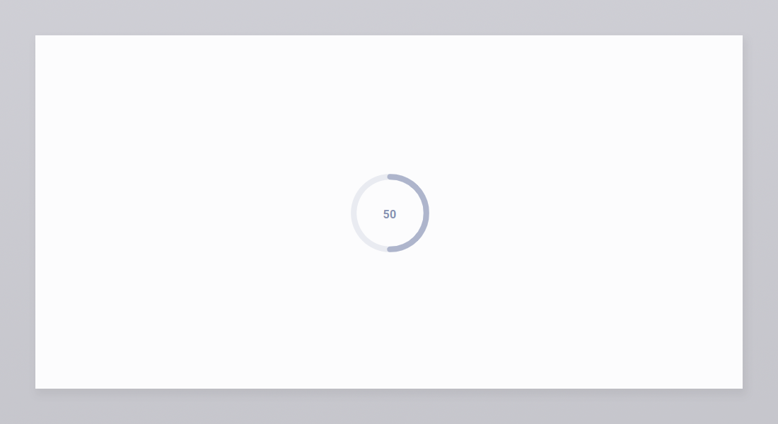
Let's tackle another one. How about the 8th one? It's kind of interesting as it's a circular progress bar.
We'll start by adding an SVG Element which will allow us to draw some graphics. The viewBox property defines the size of the viewport. In this case, it's 100px wide and high. We'll use this size when drawing stuff and it will be stretched/shrunken correctly when resizing the SVG.
<svg
      height={ width }
      width={ width }
      viewBox="0 0 100 100"
      version="1.1"
      xmlns="http://www.w3.org/2000/svg"
    >
</svg>
We'll start with two circle elements, placing them in the middle and giving them a radius and a stroke width. SVG elements have two properties to define their colors. The fill is like the background color and the stroke is the border of the element.
Like before, we'll create two styled components:
<Circle
  cx="50"
  cy="50"
  r="38"
  strokeWidth="6"
/>

<FilledCircle
  cx="50"
  cy="50"
  r="38"
  strokeWidth="6"
/>

const Circle = styled.circle`
  fill: transparent;
  stroke: hsla(225, 20%, 92%, 0.9);
  stroke-linecap: round;
`;

const FilledCircle = styled(Circle)`
  stroke: hsla(225, 23%, 72%, 0.9);
`;
We'll use absolute positioning to place a text with the current progress in the center of the circle.
<Text data-testid="progress-bar-text">
  { progress }
</Text>

const Text = styled.div`
  align-items: center;
  color: hsla(225, 23%, 62%, 1);
  display: flex;
  font-weight: bold;
  height: 100%;
  justify-content: center;
  left: 0;
  letter-spacing: 0.025em;
  margin-bottom: 1rem;
  position: absolute;
  right: 0;
  top: 0;
  width: 100%;
  z-index: 100;
`;
Now for the tricky part. How do we make the FilledCircle only partially fill depending on the progress? We could use an SVG Path to draw a line in the shape of the circle but that seems like an awful lot of math and trigonometry. 😨
Luckily for us, there are a few properties on the circle element we can use to accomplish this. Namely stroke-dasharray and strokeDashoffset. The dasharray property creates spaces within the stroke, much like how the dashed version of a border works on normal HTML elements.
This is how circles look with a dasharray of either, 4, 10, or 20 pixels.

So the idea is to set the dash array to the same size as the circle. That way we'll get two circles, the first one will be transparent and the other one will have our fill color. Then we'll use the stroke-dashoffset property to push our filled circle into view.
For this, we'll need to use a little bit of math to calculate the circumference. If you remember your high school math, or you like me forgot about it and googled it instead we'll see that it's radius * 2 * PI.
const strokeWidth = 6;
const radius = (100 / 2) - (strokeWidth * 2);
const circumference = radius * 2 * Math.PI;
Once we have the circumference, we can calculate the offset based on the progress.
const offset = circumference - progress / 100 * circumference;
All in all, it will look like this:
import React, { ReactElement } from 'react';
import styled from 'styled-components';

interface CircularProgressBarProps {
  progress: number;

  label?: string;
  width?: number;
};

export function CircularProgressBar({
  progress,
  label = 'Progress Bar',
  width = 300
}: CircularProgressBarProps): ReactElement {
  const strokeWidth = 6;
  const radius = (100 / 2) - (strokeWidth * 2);
  const circumference = radius * 2 * Math.PI;
  const offset = circumference - progress / 100 * circumference;

  return (
    <Container>
      <svg
        aria-label={ label }
        aria-valuemax={ 100 }
        aria-valuemin={ 0 }
        aria-valuenow={ progress }
        height={ width }
        role="progressbar"
        width={ width }
        viewBox="0 0 100 100"
        version="1.1"
        xmlns="http://www.w3.org/2000/svg"
      >

        <Circle
          cx="50"
          cy="50"
          r={ radius }
          strokeWidth={ strokeWidth }
        />

        <FilledCircle
          cx="50"
          cy="50"
          data-testid="progress-bar-bar"
          r={ radius }
          strokeDasharray={ `${ circumference } ${ circumference }` }
          strokeDashoffset={ offset }
          strokeWidth={ strokeWidth }
        />

      </svg>

      <Text data-testid="progress-bar-text">
        { progress }
      </Text>

    </Container>
  );
}

const Container = styled.div`
  position: relative;
`;

const Circle = styled.circle`
  fill: transparent;
  stroke: hsla(225, 20%, 92%, 0.9);
  stroke-linecap: round;
`;

const FilledCircle = styled(Circle)`
  stroke: hsla(225, 23%, 72%, 0.9);
  transform: rotate(-90deg);
  transform-origin: 50% 50%;
  transition: stroke-dashoffset 0.5s ease-out;
`;

const Text = styled.div`
  align-items: center;
  color: hsla(225, 23%, 62%, 1);
  display: flex;
  font-weight: bold;
  height: 100%;
  justify-content: center;
  left: 0;
  letter-spacing: 0.025em;
  margin-bottom: 1rem;
  position: absolute;
  right: 0;
  top: 0;
  width: 100%;
  z-index: 100;
`;
And that's our second progress bar! 🍾
Here are both of them in action.
You can find all the code for this article at GitHub. If you want to show ❤️ and support, star the repository. 😄